Mobile APP design trend has undergone many changes in 2017. Artificial Intelligence, Chat Interface, Responsive Design, Virtual Reality (VR) and Augmented Reality (AR) keep designers constantly confronted with new challenges.
Research shows that users spend an average of 158 minutes per day on smartphones and tablets, 127 minutes of which is consumed in various APPs. It’s an indisputable fact that the development of mobile APP is rapid. As we continue to absorb new things and master the new trend, we also need to confirm whether these App UI design trends have been verified. The following are the most influential trends for mobile App in 2017:
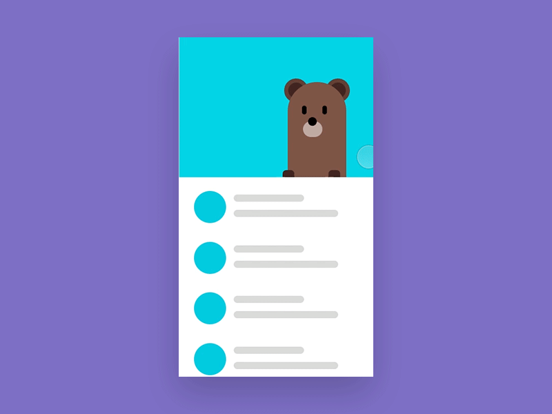
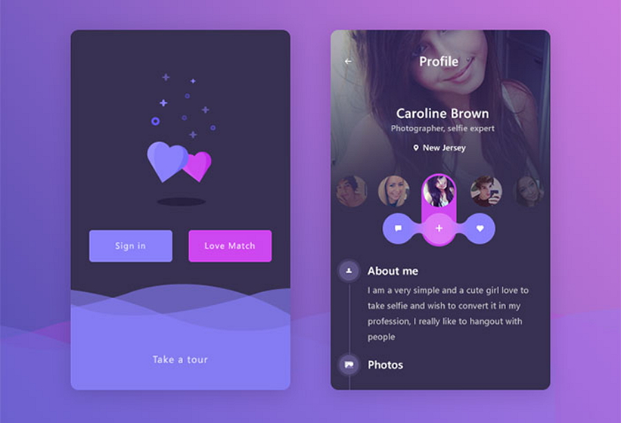
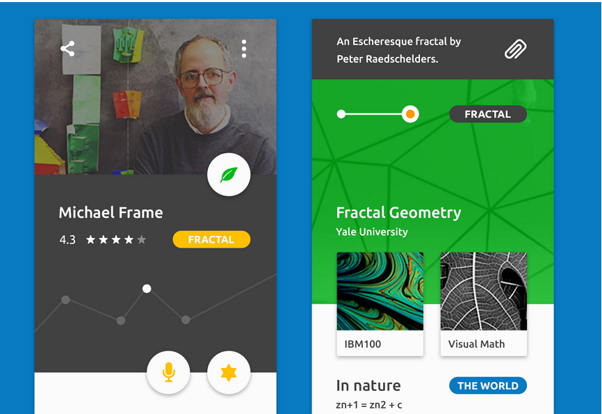
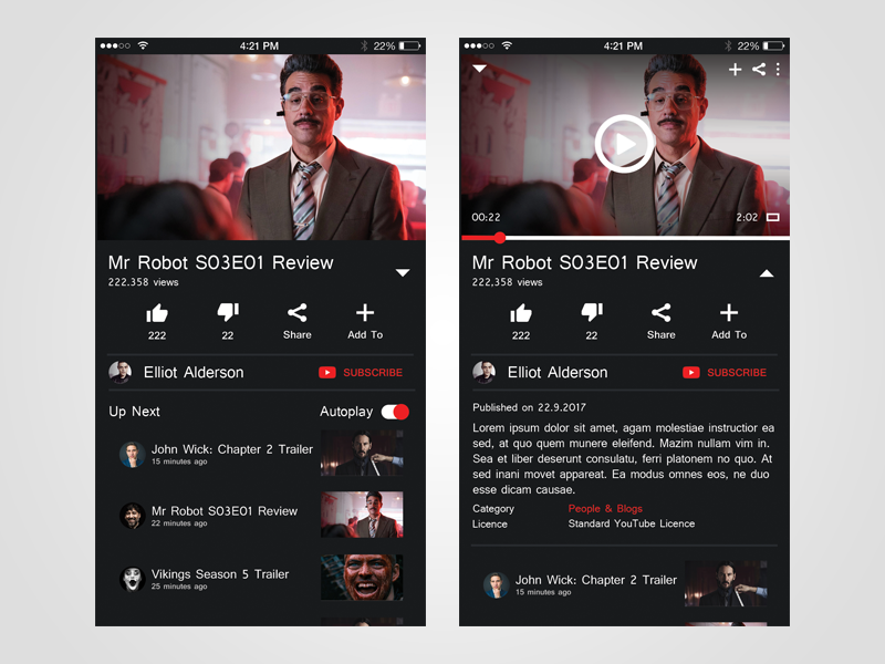
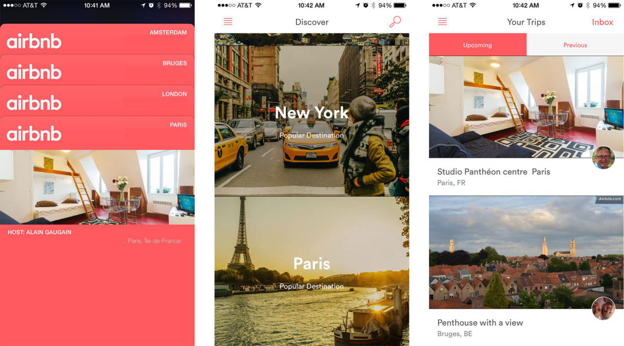
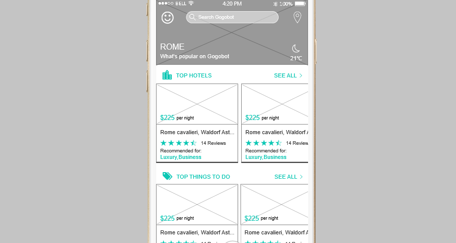
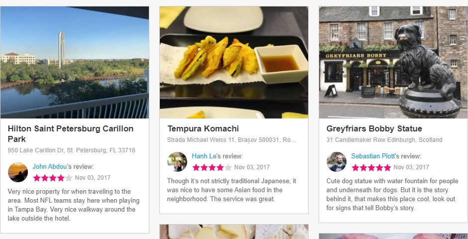
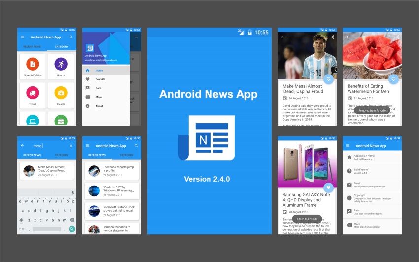
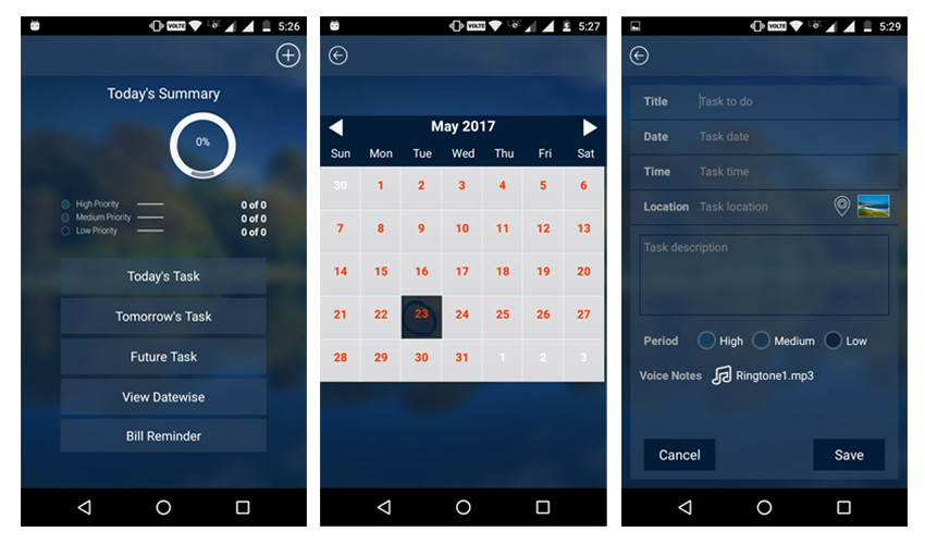
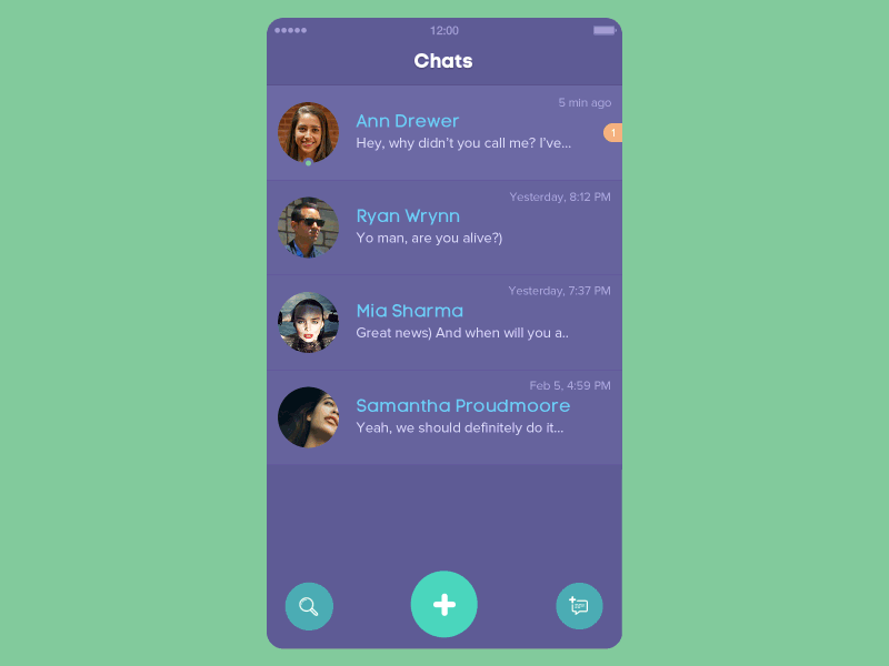
1. Card View
As mobile devices become more and more important in the Internet, how to make the boundaries of the interface between the mobile and the desktop more ambiguous and the user experience more traceless are the problems that the designers urgently need to solve. Card view is a good solution to this problem.
As a carrier of interactive information, the card provides fast and relevant information in a condensed form. Beautifully designed card view can quickly capture the user’s eye, fully adapt to the responsive web and has high readability.
Organizing and arranging content flexibly on a smaller screen is invaluable. The card provides an all-in-one solution for text, images and video across multiple media content. So far, App Store, Facebook, Google and Twitter have been completed the iterative update of the card design, I believe this trend will remain strong in 2018.
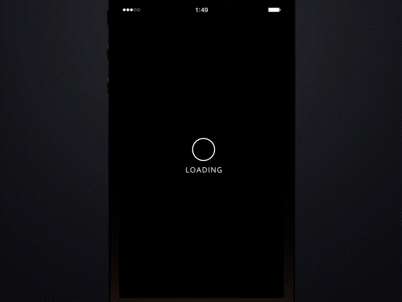
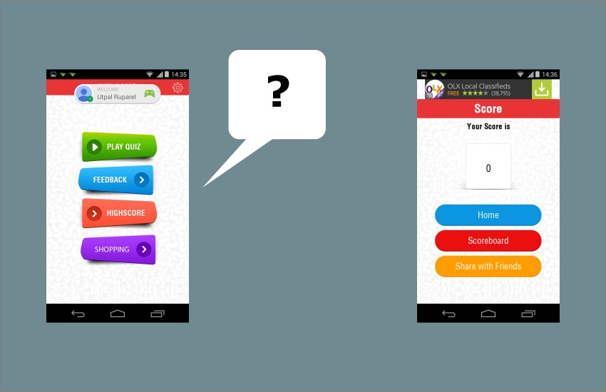
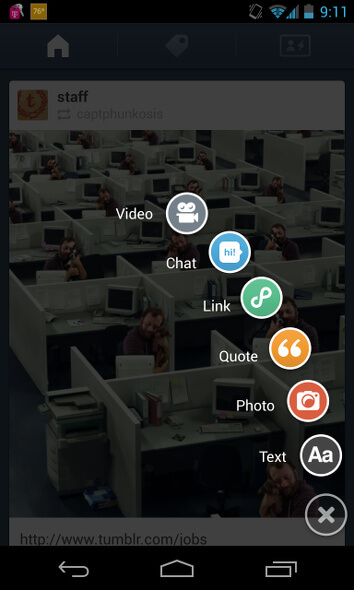
2. Micro Interaction
From the beginning of 2016, micro-interaction has been a hot topic. And in this review of 2017, we still can not avoid the topic of micro-interaction.
In the mobile app, micro-interaction presented on the small screen plays a crucial role in user experience and interface. For the user experience, micro-interaction provides users with intuitive and user-friendly feedback and can convey some subtle state and a sense of anticipation.
The reason why micro-interaction works are because it raises the original desire of people to always want more information. Users can instantly get visual feedback after an operation, which will make people full of desire to continue operation. Micro-interaction can also be used to guide the user to the correct operation.
Specifically, smart designers use interesting interactions such as loading animations, smooth icon switching to attract users’ attention. In the long run, micro-interaction will become a more rich topic, it is worth designers to continuously explore and innovate.
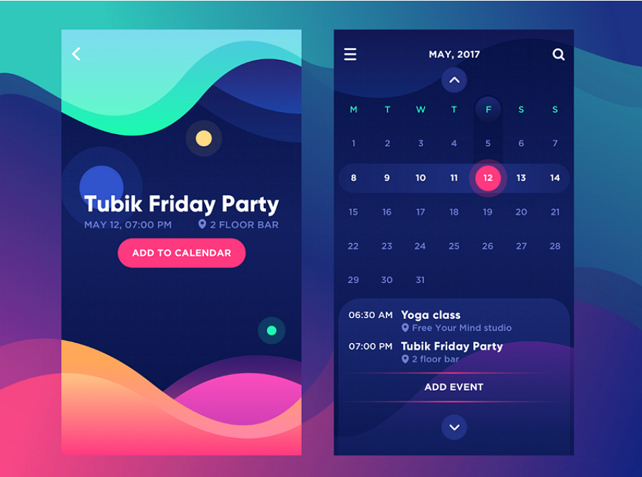
3. Long scrolling and parallax
Long scrolling is a great way to convert content from desktop to mobile, helping users get a lot of uninterrupted access to one-way swipes.
However, the long scrolling rolling has been very popular, it’s more worth to mention parallax scrolling. The principle of parallax is to allow foreground and background to scroll at different speeds, creating a deep visual perception. On this basis, many designers have begun to try parallax scrolling of multi-graphical elements, presenting a complete story just by scroll and graphics.
The appropriate scrolling effect will not only be able to raise efficiency and hierarchically transfer content and information but also elegantly and smoothly improve the sense of sophistication of the product itself.
This site is the best case of long-range parallax effects and you can find out more about it at http://everylastdrop.co.uk
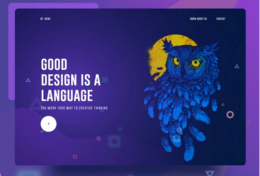
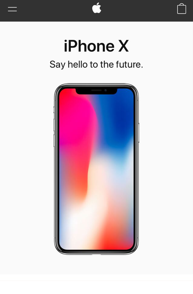
4. Full-screen video
Vision is always the most perceptive of people. Big banner image has become the mainstream design trend in recent years, and the success of the big image and the development of bandwidth paved the way for full-screen immersive video, the appearance of dynamic video in product design gets much common.
Huge, dynamic and beautiful visual perception is actually in line with the pursuit of natural beauty of mankind itself, immersive video has much value to app home page so that the background layout can be more gorgeous.
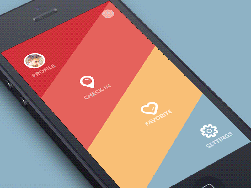
5. Half-flat design
Flat style has occupied half of the design market. Under the influence of the card view, in order to highlight content and perception, flat design has become more three-dimensional and multi-dimensional by using a lot of shadows and contrast.
The smooth shadow enhances the depth and complexity of the interface without any conflict with the original style. It is believed that the flat style will not stop at the current overall style, and more modes will be incorporated to optimize and innovate continuously.
6. Augmented Reality
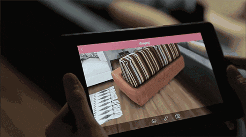
With the launch of Animoji on the iPhone X, 2017 will be the year of AR technology in mobile apps. With technological advances, this year’s AR products have made tremendous breakthroughs in information integration, real-time interaction and precise positioning. In addition, AR is not only used for children’s science and education cognition nowadays but also has been greatly enriched in the field of mobile product application. Now it has covered fields such as military, medical, building, education, engineering, film and entertainment.
What worth mentioning is the IKEA Catalog APP, as early as two years IKEA has begun attempts on the field of AR, limited to the then technical, the experience was relatively poor at that time. At present, this App has been able to present the IKEA products in 3D in a more accurate manner. With the hand-held mobile phone rotation angle, the proportion of virtual furniture can appear in any corner of the house, and the purchasing experience of furniture has been greatly improved.
7. Gradient color
The gradual change of colors has gradually come into view since Instagram logo changes. The reason is that the flattening style is extremely easy to cause homogeneity, and the design language that pursues visual richness is beginning to return. Except the semi-flat style mentioned above, visually intriguing gradient color can firmly grasp the user’s eye, and simple graphics and high saturation gradient color can strike the right balance between design convenience and visual component sense.
Accurate use of color is conducive to arousing the user’s emotions and create a personalized product that allows users to perceive your product through color.
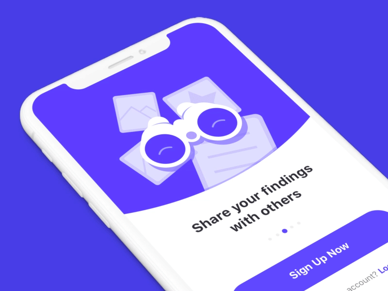
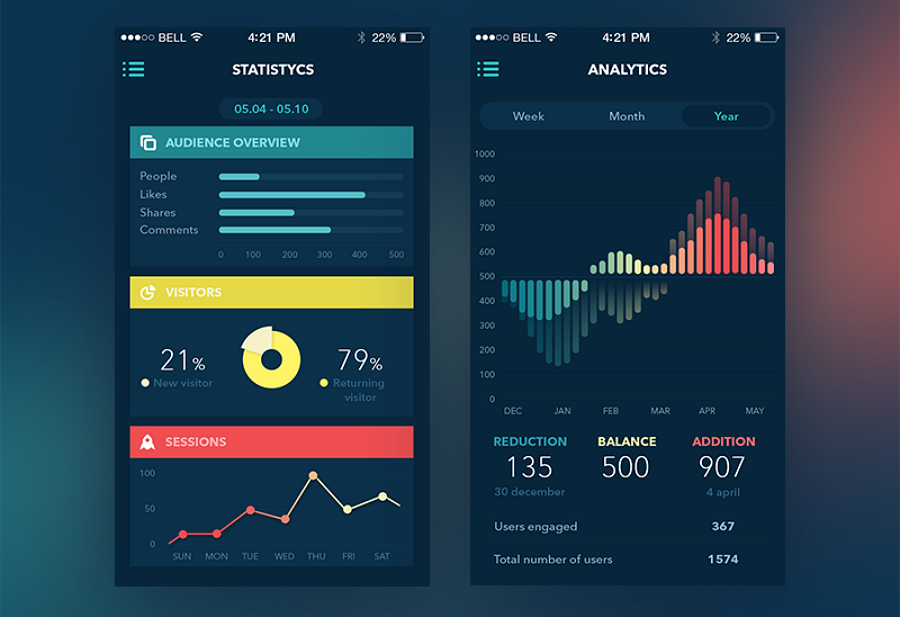
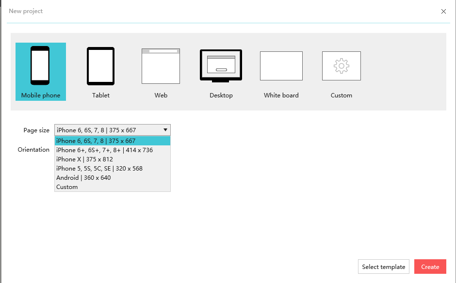
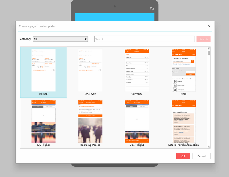
8. Prototyping
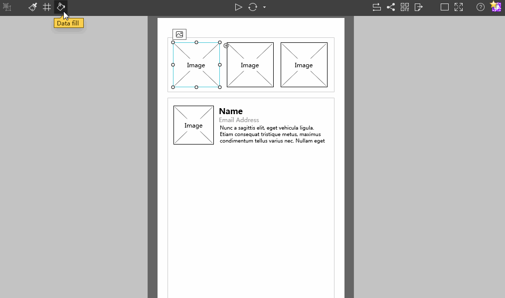
As the user experience and interface design continue to be integrative, the prototyping design plays a more important role in the app design. High efficiency and visualization are the industry’s potential demand for prototype design this year. Prototype design tools are always under optimization, for example, Mockplus latest version 3.2 supports fast data auto-fill, exports the UI flow of a project with only one click, accelerating efficiency of prototyping on the mobile, thereby improving the overall workflow, leaving more time to think about the user experience.
Summary
2017 is a year of transition. On the one hand, the development of AI, AR and VR technologies powers app design. There are numerous unknown possibilities and opportunities in the future. On the other hand, the basic people-oriented principle of design will continue to guide app design to a correct direction. Regardless of the mobile app design trend, designers have to stick to their own ideas of judgment, resulting in sustained learning and innovation.
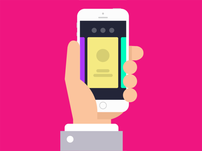
 What attractive in design: Thumb design
 What attractive in design:
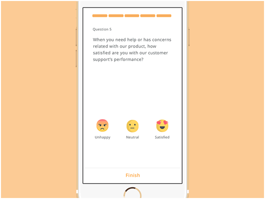
 Site Title