app, mobile, UI/UX desingn, Uncategorized

Top 9 UI Design Trends for Mobile Apps in 2018

Mobile app User Interface design trends keep changing based on varying user needs. However, that does not mean UI design trends for mobile apps in 2018 could not be predicted. Actually, after carefully analyzing UI design trends and innovations in the past few years, we could find some laws behind and predict the possible trends that will also continue into the following 2018. Hence, here we will share top 9 UI design trends of mobile App for you in 2018:

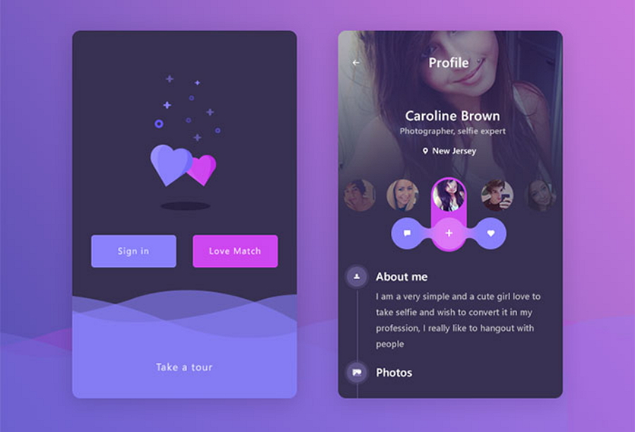
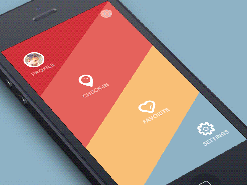
1). Overlapping effects

The overlapping of fonts, graphics and colors cannot only make UI designs more eye-catching and distinctive, but also create a sense of space. And that’s also why overlapping of different mobile app UI design elements has been widely used by designers in recent years.

Moreover, in some cases, the overlapping of the same elements, combining with shadows, will also make the whole mobile app interface designs more fantasy and impressive.

Hence, the overlapping of different elements in mobile application UX design will also be a trend in 2018.
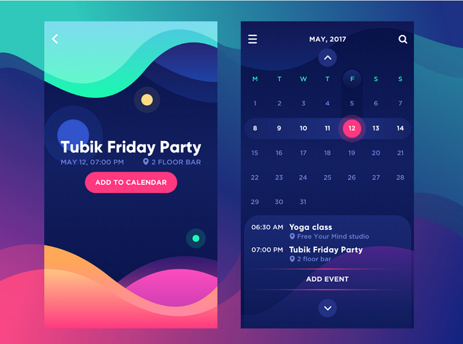
Mobile App UI Design Trends Overlapping effects

2). Color Gradients

In last few years, rising numbers of designers adopt color gradients in their design works when they are trying to design logos, buttons and backgrounds for mobile app interfaces. Why? The answer is simple. Even when you have chosen a single color, you can also show a rich sense of hierarchy and draw a beautiful picture while combing it with color gradients and different graphics.

Therefore, the color gradients will not only be popular throughout 2017, but also will continue in 2018.

Mobile App UI Design Trends Color Gradients

3). Opacity

The same components can have different effects after you have adjusted or set their transparency. So, while designing phone app interfaces, setting the opacity of different components is a nice way to work out an excellent design work.

Moreover, the transparency settings for different colors or graphics can also create a colorful glass texture for app interface components. And that’s why designers widely use this method into mobile app logo designs.

Overall, no matter how you will add opacity effects to UI design works for mobile apps, setting transparency of different components will have a definite rise in popularity for the next year.

Mobile App UI Design Trends Opacity

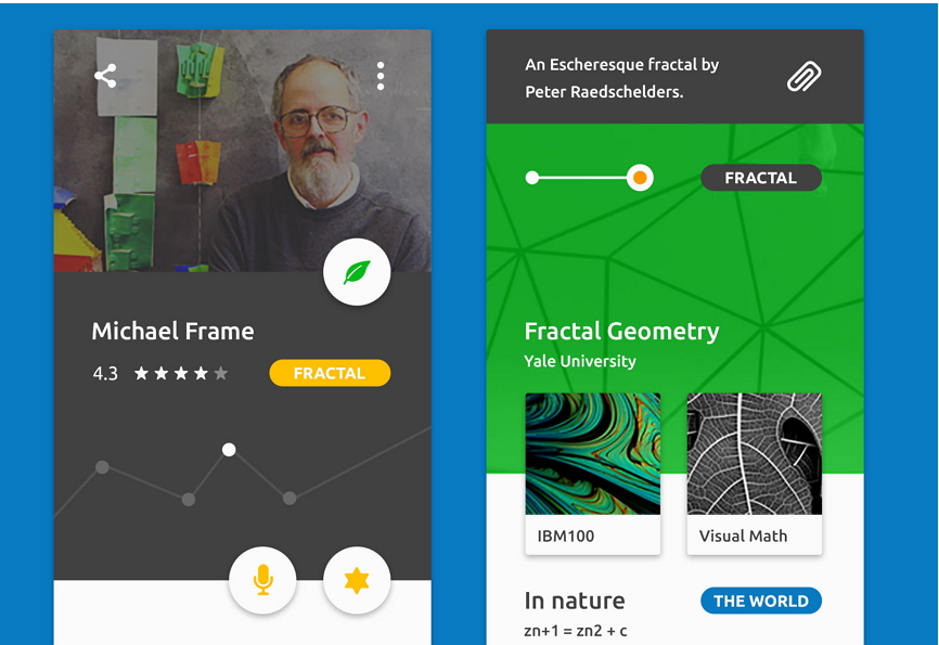
4). Simple curves and geometries

In comparison with a complicated and changeable UI design style, more and more designers have adopted a simpler and more natural design style in mobile app UI design. For example, in comparison with a phone app interfaces covered with various colors, graphics, buttons, pictures, animations and more complicated elements, a phone interface with simple curves, geometries and buttons could be more effective for people to focus on the major functions and features of a mobile app.

So, this way will also be trending all the way across 2018.

Mobile App UI Design Trends Simple Curves and Geometries

5). Strong color or font contrast for better readability

Strong color or font contrast could also help designers work out an excellent UI design to attract user attention. For example, adding fonts in different styles, types, sizes or orders can also deliver a sense of hierarchy and space. And color in different types and styles also create sharp contrasts and make entire designs more colorful and eye-catching.

Mobile App UI Design Trends Color Contrasts

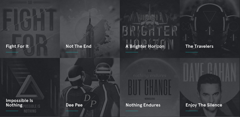
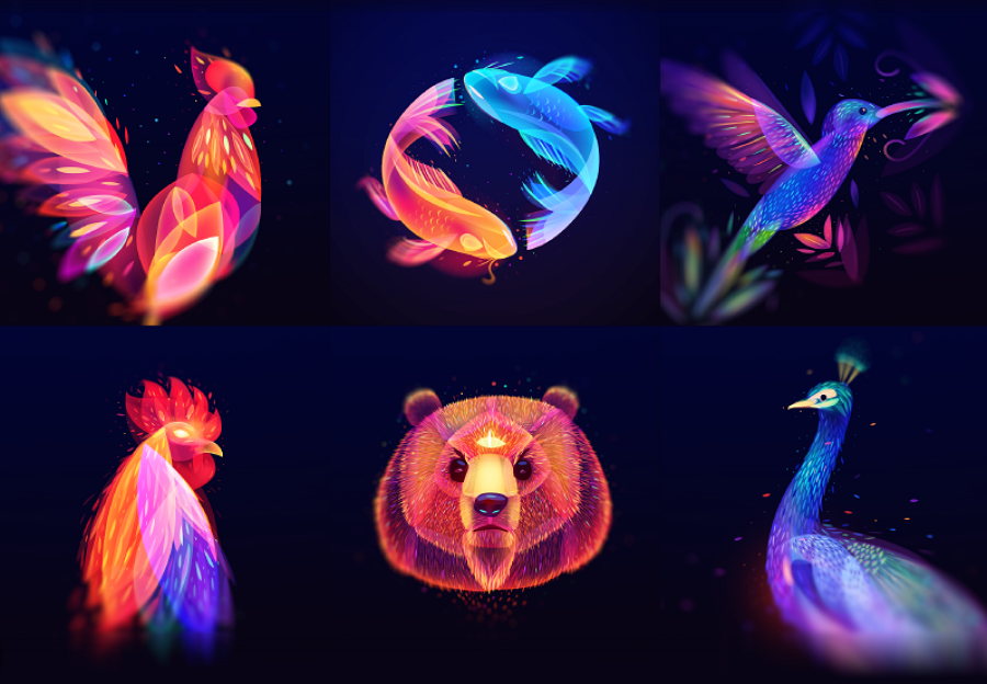
6). Custom illustration interfaces

In 2017, custom illustration also plays an important role in mobile app UI design and will also surely be popular in 2018. The mobile application interfaces with different styles of illustrations, like hand-drawing, simple style, paper-cut style and famous painting style illustrations, can not only make applications more interesting and distinctive, but also give mobile apps personalities and make them more impressive for app users.

Mobile App UI Design Trends Custom Illustration Interfaces

7). Functional animations and interactions

Adding animations or interactions to icons, fonts, photos and buttons of a mobile UI interface always has a positive impact on the app users and give users more pleasant experiences. And this trend will also continue in the following 2018.

Moreover, it is noteworthy that micro-interaction, which is initially introduced and highly recommended by Dan Saffer, will also be continuously developed and used by designers in the coming 2018.

Micro-interactions, which mean to add more interaction designs for some details of mobile app interfaces, allow users to communicate with apps easily and also get feedback soon. That is definitely a good trend which designers should follow to complete their mobile app UI design.

Mobile App UI Design Trends Functional Interactions

8). Voice-activated interfaces

Voice-activated interfaces of mobile apps simplify the operations of users. Just like using Siri, you can easily start or log in a voice-activated mobile app with voice orders instead of clicking any button or entering any password. Moreover, in 2017, most mobile apps with voice ordering services also finally became the most popular apps over the internet. So, voice-activated mobile apps will also be continuously popular in 2018.

Of course, except voice-activated interfaces, fingerprint-activated interfaces will play an important role in the mobile app interface designs in the future.

9). Mixing different trends will also be a trend in 2018

In actual design cases, designers will not only use one method mentioned above to complete their app UI designs. Oppositely, they will often adopt two, three or more methods, like overlapping effects, color gradients, functional animations and color contrasts, etc, together to get much better and unexpected effects.

Hence, mixing different trends in mobile app UI design will also be a trend in 2018.

Wrap up

Mobile app UI designs are as complicated and changeable as user needs. So, no matter whether these top 9 UI design trends for mobile applications will really gain their era in the upcoming 2018, as a UI designer, you are always supposed to stay innovative and creative all the time, grasp user needs constantly and combine new scientific and technological achievements timely. And then, it will not be hard for you to complete a mobile app UI design with distinctive interfaces and good user experiences.

Uncategorized

Mockplus Repeater vs. Adobe XD Repeat Grid – the Latecomer Surpass the Former

When making prototypes of a product, we often found that there are a large number of duplicate parts on the same page. Although these elements can be copied, you can only edit them one after another repeatedly when your customers want you to make some adjustments of these elements. Finally, you will waste a lot of time and be not able to prototype faster and easier. So, we need a new feature that not only help people to quickly copy page elements, but also modify properties of these same elements efficiently, so that we can edit elements of pages quickly.

In order to meet this demand, Adobe XD released its Repeat grid. Besides, Mockplus v3.2 also added a new feature – Repeater. In order to make a clearer comparison of these two features, this time I conducted a testing between them. Let us check out how they work!

1. How to create a Repeat Grid / Repeater?

Adobe XD places the Repeat grid on the right side of its property panel. That allows users to click this button to convert the components to Repeat grid or exit from Repeat grid. In Mockplus, you can directly find this option on right click menu or the tool bar. In addition, using right click menu to convert to a repeater would reduce the frequency of mouse movement and improve design efficiency.

2. Add a grid

In Adobe XD, after you converting a component to a Repeat Grid, there would be two handles on the right and bottom of it, and you can pull the handles to add grids. In Mockplus, you have more ways to create a new grid. Firstly, you can pull these eight dots to create new grids in eight different directions. In addition, there are also two handles on the right and bottom of the Repeater, but the use of them is different from Adobe XD’s. Here we take the vertical direction as an example, when the last line shows incomplete, click the handle on the bottom, then the last line would be completed. If the last line shows complete, then click the handle, it would add another line (Besides, you can use this feature to create the Repeater cells one after another).

3. Gap setting

Adobe XD and Mockplus set the gap in a similar way. Select one grid, then drag the red line above the box to adjust the gap. Besides, in Mockplus, you can also set column gap and row gap through the properties panel on the right side, which makes users adjust the gap more accurately.

As for layout type, in Mockplus, there are three different layout types. You can select the “grid”, “vertical” or “horizontal” on the properties panel on the right side. For example, if you chose the vertical layout, the new generated grids would appear vertically.

In addition, you can also adjust the border and the inner separator of Repeater. I think it is very useful. When you need to adjust the layout of some forms, you can directly set the horizontal separator through the properties panel without putting a line among them, this is very convenient to operate. While Adobe XD doesn’t have this property.

Some friends may ask: What if I only want to modify the properties of one grid without changing the properties of other grids? It is worth mentioning that, in the Repeater of Mockplus, you can click”Separate” on one grid to divide the setting of this grid from others, so that you can modify properties of all grids, or also choose to modify properties of one grid. Isn’t it more convenient? And I also tried in Adobe XD, but it does not support such function.

4. Operations in grid

As for adding or deleting the grid, Adobe XD and Mockplus have same operations. When you drag a new component, all grids would add the same component in the same location. After deleting a component, if there is only one component in the currently editing group, it will be automatically disassociated and returned to the previous group, and other cells would synchronize this operation; if there is no any component in the grid, then the entire Repeat grid or Repeater will be deleted.

5. Automatic filling of data

In the Adobe XD Repeat grid, you can drag one or more pictures once. If there is only one picture, the picture will automatically adapt to the size of the component. If there are more pictures, they would automatically adapt to the size of components as well as be sorted.

Mockplus supports auto data fill of images and texts. This practical feature can usually be used in the following two occasions:

1. Single or batch fill of images or texts.

2. Used in Repeater to create components with repeating elements (for instance, a list), which greatly saves designers’ time.

This is the Repeater in Mockplus and Repeat Grid in Adobe XD. Before you make a choice, try both of them. 

Uncategorized

How to Make a Mouse Hover Drop Down Menu with Mockplus?

5

Those who have used Mockplus know that the prototyping tool doesn’t support mouse hover directly now. But today, I found that it’s not so hard to realize a mouse hover event with Mockplus as long as I change my methods. For example, the mouse hover drop down menu, which can be easily made with the state interaction of Mockplus.

(In the last article I introduced that how to create an accordion menu with Mockplus quickly in 3 steps. If you are interested in it, just go through it and I believe that you will benefit a lot.)

Now let’s go back to today’s topic and see how to make a mousehover dropdown menu with Mockplus easily:

Step 1 – Make a menu with Rectangle.

Launch Mockplus. Drag a rectangle component to the canvas and copy it for several times. Make one of them as the top of the menu,and the others, the content part (see the following image) .

Select the first rectangle in the content part and uncheck the “visible” property on the properties panel on the right. Then, group the five rectangles.

 Make a menu with rectangle

Step 2 – Move the rectangles

Put the blue rectangle to the place of the invisible one. On the properties panel, send the blue rectangle backward. Now you can still see it since the component covering it is invisible(1st step).

 Move the rectangles

Step 3 – realize the mouse hover dropdown menu with state interactions.

Select the group. Set the opacity value as 0 and click the lighting icon near it. Select “MouseHover” option and set the opacity value as 100.

state interaction

Now a simple mouse hover dropdown menu is created. Click the “Preview” button on the top of the interface to see the effect.

This is the magic power of prototyping:realize infinite effects with finite elements. It’s just like playing the piano.The keys are limited but the music is infinite. For those excellent designers,it’s not how many functions a prototyping tool has that matters most, since the more features a tool has, the more complicated the operations are.

As an easy-to-use prototyping tool, Mockplus enables designers to create products on a simple but not limited platform. Thus, whether you are new to design field, or you are a veteran designer/PM, Mockplus really worth a try.

A short introduction to Mockplus

Mockplus is a desktop-based tool for prototyping mobile, web and desktop apps easily and quickly. Create interactions by simple drag-and-drops and your teamwork will be time-efficient with the collaboration features.

This is the way to make a hover drop down menu with Mockplus. For more tutorials, go to doc.mockplus.com.

Uncategorized

25 Best Personal Website Design Examples and Resources for Your Inspiration

3

What is the best way to present UX/UX designer’s work with personal style? I guess a personal website maybe the NO.1 choice. Actually, a personal website serves far more than that. Usually, personal website can be classified into main 5 types due to the features and purposes. If you are still hungry for personal website design inspiration, keep reading.

5 main types of a personal website:

1) Resume – for job hunt.

2) Blog – to share design inspiration, to communicate with others.

3) Portfolio – similar to Dribbble or Behance, display designer’s work.

4) Personal brand – to get known, get famous and get more opportunities.

5) Online shop – for commercial.

6) Gallery – a collection of designer’s work or writing stuff or demos

In fact, personal website presents a variety of different design styles and functions. For example, portfolio and blog, work experience and portfolio. Some are one page with minimal and clean style, some use bright and vibrant colors. Anyway, hope you like the 25 personal website design examples.

1. Personal website design of resume style

1) Devon Stank

What you can get here: Resume, Portfolio, Blog

It clear shows what Devon does one the clean and neat welcome interface. The video are appealing and presents his skills and work experience just right. With the blog and portfolio, his site can leave visitors a great impression.

 Devon Stank

2) Gary Sheng

What you can get here: Resue, Portfolio, Personal brand

This is a typical resume personal website. “Hi, I’m Gary Sheng”. on the welcome screen, you’ll see a nice boy greeting with you. It’s nice and warm. There are plenty good-looking logos and clickable links shows his design and development skills and leading visitors to a more wonderful world with detailed information. Check this one out and leave your resume document away

Gary Sheng

3) JESSDESIGNTAN

What you can get here: Resume, Portfolio

The simple personal website uses blue as the background with word in white, and presents a clean and simple welcome interface. His choice of color in UI design is pretty wise. You’ll see his skills like JavaScript, CSS, Java, and PHP as well as experience and education properly organized. Like what he believes, “ Offering creative design solutions to solve business problems is what I do best.”

JESSDESIGNTAN

4) Thalida

What you can get here: Resume, Personal brand

Thalida is a Senior Software Engineer. Lucid Dreamer. She is a queer Trinidadian-American cisgender woman of color. On the welcome page, she divides the page into 2, the left is static while the right part can scroll sown to see her education, projects and work experience. She uses yellow highlighted words to draw attention.

Thalida

5) Nik Papic

What you can get here: Resume

Nik.org is the eponymous online home of Nik Papic—designer, developer, marketer, perpetual entrepreneur, and aspiring polymath. This is a concise description on his welcome page. Pretty clean and all in one color background is in good-looking. Besides, I personally like the font.

Nik Papic

By the way, more fonts materials : Package of 1,208 google fonts.

2. Personal website design for blogs

1) Miss thrifty

What you can get here: Bolg

Miss Thrifty is one of the mort popular frugal blogs in the UK. Miss Thrifty is targeting young mums with her money saving, frugal tips and articles. The market is massive and she’s meeting a need for this type of information. Young mums aren’t exactly rolling in cash. They may have had to give up work and are now relying on just one wage coming in, so the need to be more frugal with everyday living is a must.

Miss thrifty

2) Osvaldas

What you can get here: Blogs, Portfolio, Online shop

Osvaldas Valutis is a web designer in Klaipėda, Lithuania. He has been making websites since 2003. He is a great example of ”Web designer who thinks in code” who solves design problems and implement their technical solutions. His personal website design including a blog, online shop and the work of him. A holy mixing of promotion and presentation of his work. The color scheme is nice and soft, and the light green feels like nature.

Osvaldas

3) Coffee Table

What you can get here: Blog

Thuis is a dark-schemed one pager professional personal website, which is the coffee-tasting journal of designer Tobias Reich. Really like this smart layout and nice touch including coffee facts between sections. Besides, it’s a curated collection of coffees I’ve ordered and tasted at home.

Coffee Table

4) Jasmine Star

What you can get here: Blog, Personal brand

Jasmine Star is a popular blog about branding and marketing, meant for helping creative entrepreneurs build the business of their dreams. The founder of the blog, Jasmine Star, is a branding and marketing strategist who wants to help people create a profitable business and, thus, make a real difference in their lives.

Jasmine Star

5) Everywhereist

What you can get here: Blog, Commercial

This is a travel themed blog, which consistent branding helps visitors easily navigate the site. Visitors can go through around the site by the navigation easily and explore sections beyond the blog freely. The color usage is warm and neutral and maintain a clean interface.

Everywhereist

3. Personal website design for portfolio

1) Brett

What you can get here: Portfolio, Studio, Personal brand

Brett is a designer, developer, and creative director that specializes in creating software products. It’s totally in black and white for the welcome page with the words description. But i really love the colorful video below which containing his wonderful design works.

Brett

2) Vtcreative

What you can get here: Portfolio, Personal brand

This personal website uses beautiful load transitions and use of whitespace in this minimal One Page portfolio for French UI/UX designer, Vincent Tantardini. Just love how the contact form loads up and also how the send button appears only once you click in the message area. Also great touch with the logo transition into down arrow.

 Vtcreative

3) Charlie Waite

What you can get here: Portfolio, Personal brand

Charlie Waite is a designer from Newport Beach, CA. It’s a lovely clean colorful design in a responsive One Page personal website. It’s simple, clean, retina and responsive. You can scroll to view his excellent works of design.

Charlie Waite

4) Matinux

What you can get here: Bolg, Portfolio, Personal brand

Matin is a UX Designer in Canada. He likes to have a variety of showcases on every topic and bring ideas into wireframe and prototype and handing them into the hand of a great graphic designer and coders to create the final product.

Matinux

5) Jon Kyle

What you can get here: Portfolio, Personal brand

This is a unique personal site of a freelance web designer/developer ‘Jon Kyle’ in Los Angeles. The One Pager features interesting sorting and filter functionality. Without one single images, pretty simple and clean. Nice touch with the random positioning of contact information every time you click the @ symbol (bottom right).

Jon Kyle

More inspiration of portfolio design: 20 Best Examples of Portfolio Design Websites

4. Personal website design for individual brand

1) Dave Gamache

Dave Gamache is the previously designed Twitter & Medium. Adventuring. Excellent color contrast to form a clean and simple one page personal website. With usable click to reach out for all kinds of different media platforms.

Dave Gamache

2) Sacha Greif

Sacha Greif is a designer, developer, and entrepreneur from Paris, France but these days lives in Osaka, Japan. Say hello, or keep scrolling to explore with different color scheme to check out his Bio, Code, Projects, Writing, Podcast, etc. Nice fonts to make words vivid.

Sacha Greif

3) Nicole Saidy

What you can get here: Personal brand, Blog

Clean, spacious personal One Pager for designer, coach and speaker, Nicole Saidy. The Singe Page site featuring a lovely moving particle background effect and a Behance feed acting as a portfolio section.

I’m a designer & digital nomad from Beirut. I spend most of my time on the road with a mission to inspire people about design.

Nicole Saidy

4) Ana Santos

What you can get here: Portfolio, Blog, Personal brand

Minimal personal page for UX designer, Ana Santos. Neat little touch loading up the contact form with a subtle parallax as your scroll. Ana is a Manchester based UX Designer, she wanted something minimalist to showcase her experience and links while update her portfolio.

 Ana Santos

5. Personal website design for online store

1) Joe McNally

Joe McNally is a photography blog founded by one of the best and most influential photographers in the world. Joe McNally is an award-winning photographer who has been shooting for National Geographic Society almost all of his life.

Joe McNally

2) Pixelosaur

Responsive long scrolling One Pager for ‘Pixelosaur’ theme shop from Greece. Great to a see an established theme shop using a Singe Page website to showcase everything they do – including testimonials, awards, theme collection, blog feed and contact details.

Pixelosaur

3) Mayday Magazine

Super impressive multi-directional parallax scrolling (preview) in this One Pager for Mayday Magazine. The Landing Page also features neat Shopify integration for magazine checkout without leaving the page.

Mayday Magazine

4) Spent

Arty One Pager for Florida based painter and artist, Keith Burnson. Lots of flavour and a slick e-commerce integration for his paintings. Good work.

Emails are full, ran out of time, clients are nagging, friends are traveling, waves are flat, vacation is needed. Great, another hobby! I am spent.

Spent

6. Personal website design for picture galleries and demos

1) Fifty Coffees

“Coffee-ing with fifty friends and mentors to find my dream job.” this personal website presented the author’s series of coffee meetings in search of her next job opportunity. The most special thing is the usage of quality photography and visuals to assist in the telling of her lengthy stories.

Fifty Coffees

2) Timothy Hoang

What you can get here: Demo, Portfolio, Blog, Personal brand

Timothy Hoang is a pharmacist to Front End Developer. Portfolio and demos are keep in good check to present a picture galleries. Click the demo action you can see his wonderful design works.

Timothy Hoang

To sum up

Well, that’s all. Hope you like the above 10 personal website design examples and resources. Nowadays, you can use various website builder to create a website effortlessly. No coding and even the UI can be selected form the various themes. But still, if you’d like to design and create your own special website, you may use the Mockplus to do a prototyping. The components and interaction are easy to use, meanwhile, you can view with a HTML on a real screen. This can save you much time.

Uncategorized

12 Best Mobile UI Interactions for Your Inspiration

Placeholder Image
Mobile UI interaction is the power to maintain the vitality of the product.
Good interaction can help users quickly get feedback, cognitive layout and enhance the sense of experience and immersion. Here I collect the 12 excellent and creative interactive works for your inspiration of product design.
1. History Animation by UISTAR

History Animation by UISTAR
This APP concept promotes people to think about the way of reading on the phone. You can choose a book by clicking and sliding title, then the cover will pop up. When you read, you can still slide to select books and are free to switch to other titles.
The interaction design simulates the experience of real reading, with accustomed interactions like sliding and clicking, creating a classic and elegant reading experience.
2. Bthere

Bthere
Its landing pages are colorful, lively and lovely, which is a unique UI design example. It provides users with an excellent experience instead of tedious APP landing pages.
Through the dynamic chart transition and background color switching and some independent micro-animation elements (including wheelbarrow exhaust), Bthere efficiently delivers the brand’s enjoyment, which also improves the user conversion rate and time on page.
3. Bon App!

Bon App
When you travel to a new city, filling your stomach is the most important thing. Bon App! may be your best choice. You can check out the best local food, explore the food salon and share your own experience.
Insights of the industry-leading UXers and PMs in China
UXer Talks
This APP prototype made by Mockplus switches its content naturally and smoothly. When tasting the food, you can click the release button on the navigation bar on edge of screen, instantly record suddenly flashed inspiration. On the food recommended page flow with intuitive structure, you can quickly access to the restaurant’s specific information and pictures.
Download link: https://www.mockplus.com/sample/post/bon-app
4. Parking Search by SELECTO

Parking Search by SELECTO
Parking in the big city is always a very troublesome thing. Finding the parking lot efficiently is very urgent.
This APP will provide you with the nearby parking location and bills. When you click on a position, you can find the number of remaining parking lots, but also provides a way to make an order instead of being to a locked door.
As for the interaction, the bright spot of this app is showing information card after selecting the parking point, quickly drawing the best route, adding the number of parking points and pushing picture and information of parking point.
5. WIP Discover Music

WIP Discover Music
This APP focuses the user’s attention on the process of navigation, finding the music becomes smoother and smarter. In addition, this interactive way also enhances the use of immersion, which is a very creative music player.
6. Cafe Coupon App

Cafe Coupon App
Food is always the best way to let us close to the world. This APP’s interaction also conveys this information. By providing coupons and discounts in the cafe, customers can immediately use the electronic coupons to buy favorite food with this app. By adding interface animation, the overall interaction becomes lively, full of vitality, and also adds some micro-interaction, full of fun.
7. Sport App by Sergey Valiukh

Sport App by Sergey Valiukh
More and more people use mobile devices when exercising to save data and track progress. Sports applications are currently very popular.The structure is very simple: the side menu and the main content. The menu moves from the left to right to show the basic options.
The main feature is opening the side of the menu when the content of the “rubber effect”. Opening the side of the screen menu, you can also display all the details of the content. Color matching is very fresh and bright, to encourage users to further operation; animation in a slight sense of bounce, making the application full of sports style.
8. Siren

Siren
This APP uses a lot of different interactive animation, when you slide to the left or right. Moving the different delay elements have the effect of fluctuations, which provides users with additional feedback on the overall structure and process of the main page. In addition, this application also uses contraction elements to expand the interface of the interactive area, while ensuring that key information is always displayed.
9. Shopping Cards

Shopping Cards
This shopping APP fully utilized the design language of iOS 11, which makes a beautiful card view. Interaction is clear and natural, content distribution is concise. For the new changes and design guidelines in iOS 11, you can also have a look at this article:
iOS 11 UI Kits Freebie & What’s New UI Design Changes in It
10. Home Budget Feed Animation

Home Budget Feed Animation
Time is money, this word will never be out of date. This financial APP allows users to manage consumption and revenue, which can create a database to track the financial flow and changes in order to obtain a comprehensive statistical information. GIF show smoothly the interaction with current changes in the financial situation, and pop-up daily limit tips, which is special.
11. Animated Sliding Tab Bar by Virgil Pana

Animated Sliding Tab Bar by Virgil Pana
This APP navigation interaction takes full account of the layout on the small screen device. The user can drag the bottom of the screen to show the folding navigation. 3D folding effect has the rich sense of technology.
12. Photo Navigation Concept by Chapps

Photo Navigation Concept by Chapps
This application is based on the concept: just a few clicks, the user can get before added and tagged pictures; just one touch, you can choose the desired picture type. The whole process reminds me of the desktop image search, this operation can be achieved on the mobile device.
Conclusion

Do these works give you a full inspiration for your interactive design? One thing needs to be clear is that all the purpose of the interaction in the product is to enhance the user experience, too fancy and complex interaction may be counterproductive. If you want to recommend more mobile UI interaction, please note in the comments.