inspiration, material design, mobile

8 Excellent Mobile First Design Examples for Designer Inspiration

In 2011, Luke Wroblewski has devised a concept of mobile first design. This was undoubtedly a new design principle that broke the industry’s conventions at that time. While in the current Internet era, it has been totally accepted and lots of excellent mobile first design examples emerged. It has been proved that people or business who follow this principle to make the best mobile first design website, he will be the winner of the market and opportunities. So, that’s easy to see how important of the mobile first design for business and designers to make products.

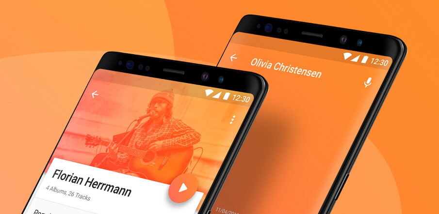
The redesign of YouTube in 2017 has already embodied the authority of mobile first design. Material Design reflects the “desktop version is a subordinate of mobile version”. Which just corresponded to Nader’s mobile first concept who is the current CEO of Microsoft.

There is a most common explanation for the current PC and mobile design. That is, previously mobile version was a reduced desktop page, while the current desktop version is an enlarged mobile app. So, I listed 8 excellent mobile first design examples for your case study and inspiration.
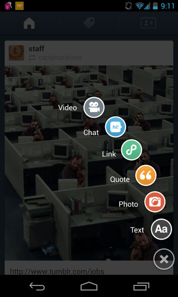
1. YouTube

Mobile first design examples-Youtube

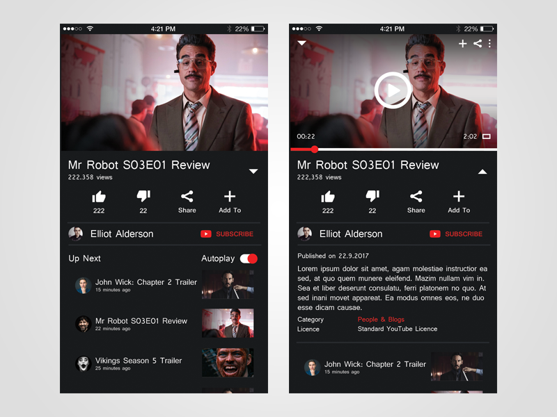
What attractive in design: Blank for button and text display, Night mode

To some degree, the Material Design language for the YouTube Desktop Web Edition also reflects the preference for mobile devices. So that’s reasonable to adopt the responsive design. So there is no doubt that the blank for buttons and text display is to adapt to the user habit on small-screen touch mobile devices.

The new night mode also shows its surrender to mobile devices. The interface of the desktop version is the white background. For the mobile device, it’s better to use the screen yellow in night-light mode, rather than the black and white background. All light removed, small screen, so the best method is to reduce the brightness to comfort users’ eyes.

2. Apple

Mobile first design examples-Apple

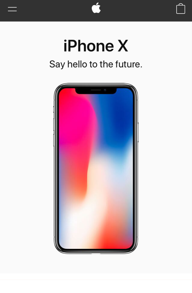
What attractive in design: Convenient scroll navigation

A user experience survey published by the Nielson/Norman Group shows that hiding navigation (like hamburger navigation) reduces content discoverability by 21% and increases navigation by 2 seconds on average. The Apple mobile website has a very good content layout. So users do not need to use the navigation button but scroll down the page to access information, very easy and convenient. The shopping bag icon is usually necessary and clear for user’s first glance for shopping. Furthermore, if no information wanted after browsing the page, you can search the desired information in the bottom navigation.

3. Pitchfork

Pitchfork
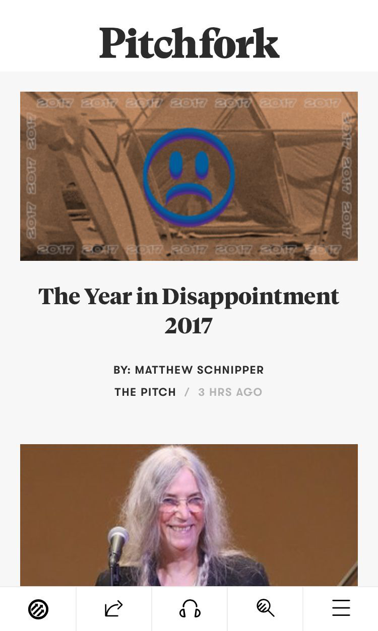
What attractive in design: Thumb design

Although there are many studies of thumbnail areas, many sites and applications out the navigation on the top of the screen. However, if you are careful enough, you will notice that the larger the phone is, the harder it is for the user to access the content on the outer edge of the screen. By contrast, Pitchfork puts the main navigation bar at the bottom of the screen, where the thumb touches most easily. With the growing number of mobile devices, this design type should be the future trend.

4. Typeform

Typeform

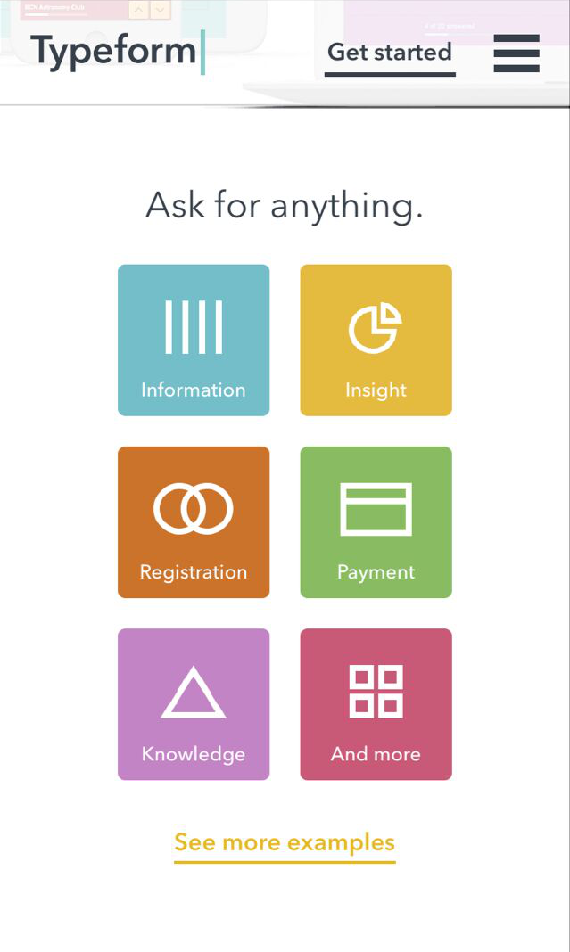
What attractive in design: Large Menu Button – Great for touchscreens

Typeform has a beautiful desktop design with a simple copy, high-definition video, animation and other design elements. But the complex design components are not user-friendly to mobile users, such as video and animation, which can significantly affect page load times. As a result, they cut down many unnecessary design elements on the mobile website page but retained the large menu buttons that work well on mobile devices, simplifying the overall mobile experience with simplicity and sophistication.
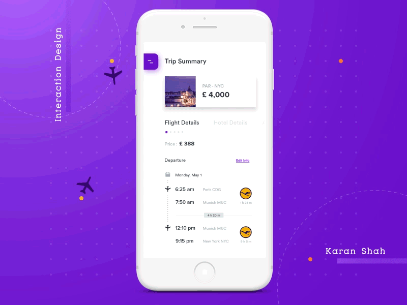
5. Airbnb

Mobile first design examples-Airbnb

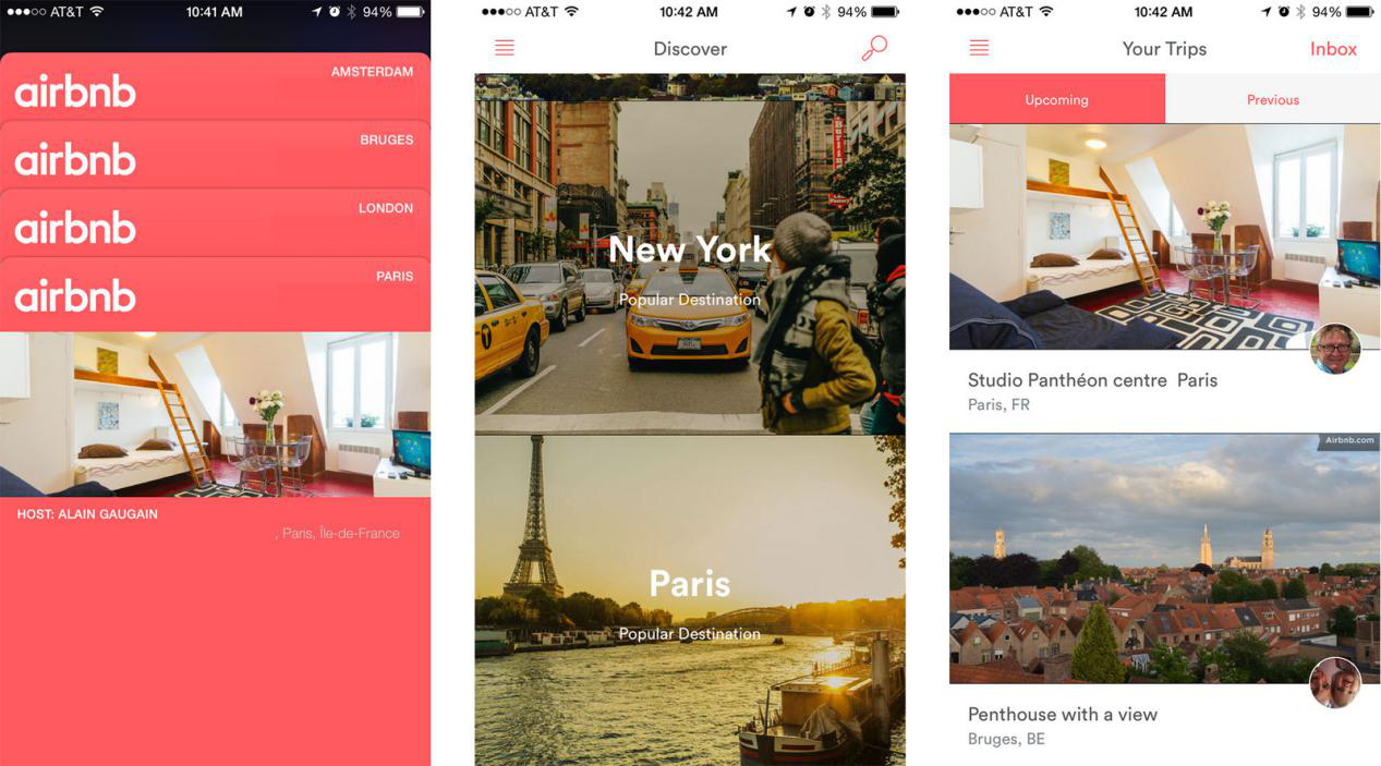
What attractive in design: Card Design

Card design makes it easier for users and information to connect with each other for a limited time. This is why Google chose card design as their design standard. Other Internet companies such as Airbnb have gradually accepted and adopted this approach. Each card’s message is concise and effective and usually consists of a title, picture, graphic, or profile text. This design gives users enough information and makes it easy for them to decide if they want to go deeper and learn more.

6. Smashing Magazine

Smashing Magazine
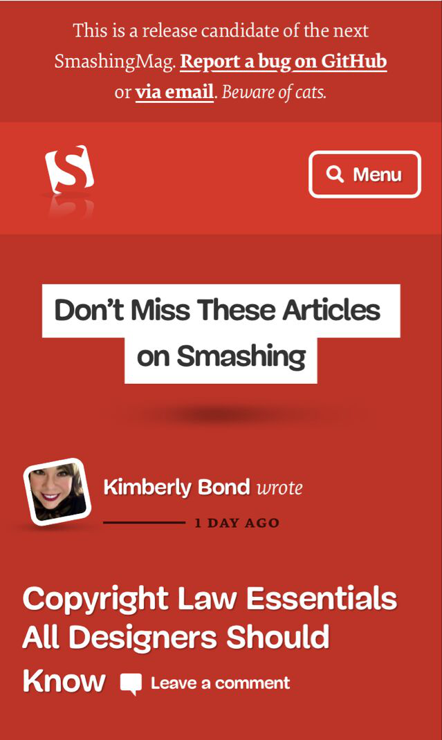
What attractive in design: Emphasis on users, rational use of screen space optimization

Data show that more and more Internet users choose to stop the content they do not want, especially mobile users in recent years. Constant navigation settings, full-screen advertising, excessive marketing terms, and these do not give users a good user experience. If you want to push user ads or lead users to continue reading, you can push selectively based on what users are viewing. That’s why the strategic layout of the content is easier for users to click. If you simply break the user experience or get them to jump pages in order to get profit, you will lose users gradually, and the profit will decrease as users lose.

7. Facebook

Mobile first design examples-Facebook

What attractive in design: Effective animation

The animations on the web pages help users to understand the current image vividly and give the user experience more expressiveness and humanity than to entertain the public. For example, MailChimp uses the Hi-five animation as a greeting after a successful mailing-out, a mini-animation of Twitter’s forwarding or liking of functions, and a vivid expression package like Facebook. But if you want to animate on the page, please make sure it is elegant and decent.
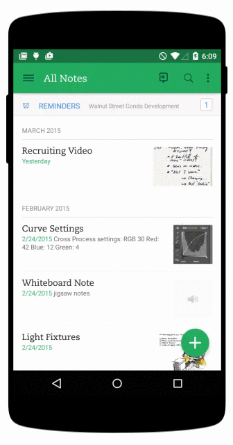
8. Evernote

Evernote

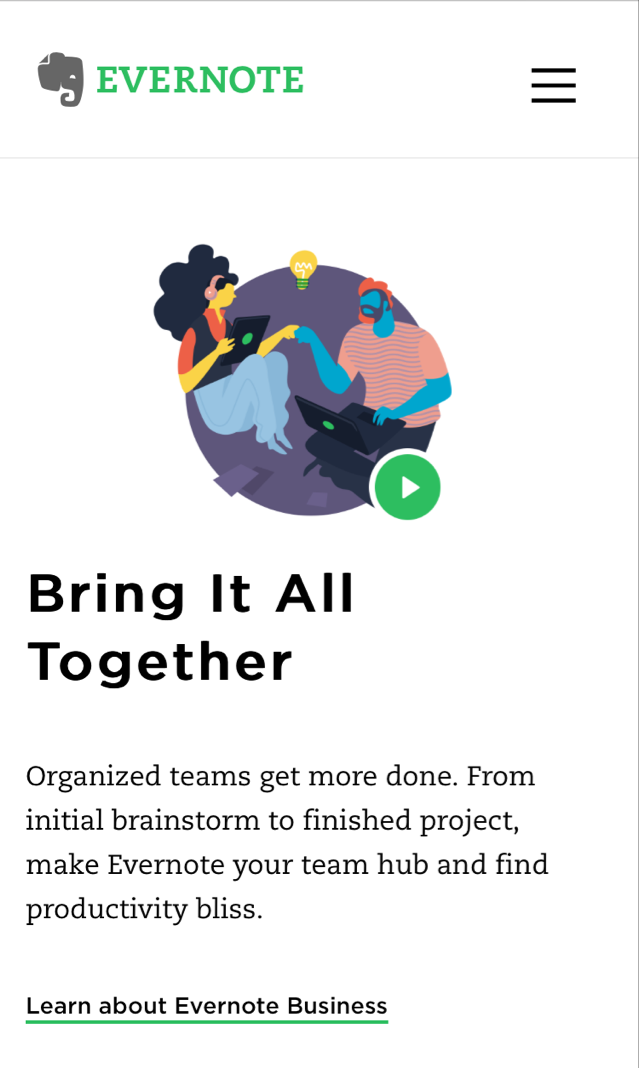
What attractive in design: Clean and fresh mobile UI interface

Evernote mainly provides note storage services which allow users to access information on all platform devices. So Evernote must get the right mobile user experience. Like the desktop version of the web design, Evernote’s mobile website design keeps the same UI design clean and fresh. In addition, the right CTA button on the web is very useful to the user.

“Web design first, and then transplant to mobile design,” this conventional model is no longer applicable today. Mobility is bound to be the design and development trend for the Internet industry in the future. Therefore, mobile first website design will become a new trend, even if this concept has existed for several years.

Why is the principle of mobile first design so important?

1. According to the Global Internet Report, up to 2016, the number of smart-phone users in worldwide has reached 2.8 billion.

2. Meanwhile, people spend more and more time on the mobile network every day.

3. As early as 2012, sales of smart-phones surpassed PC sales worldwide.

The explosive growth of mobile demand requires designers to pay more attention to the mobile version and follow the mobile design first principles in product design. So I believe that these reasons are enough for designers and merchants to study the mobile website design and benefit from it.

How to follow the mobile first design principles?

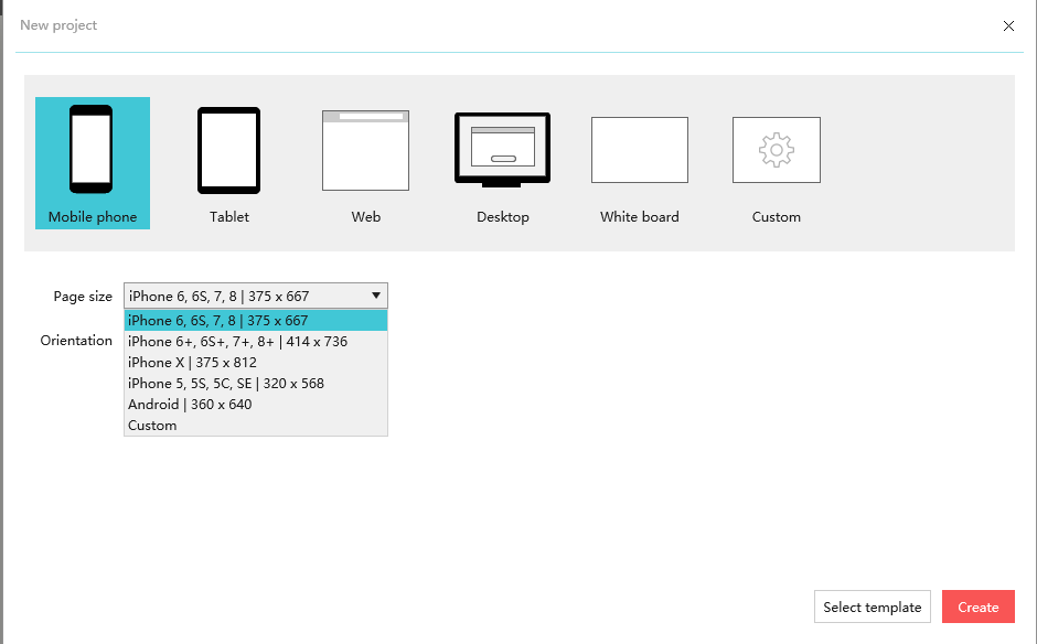
To create a mobile-friendly website that meets the mobile first design principles, a prototyping design tools such as Mockplus is needed.

Step 1: Log in your Mockplus account. If no, you can apply for a free Mockplus account.

Step 2: Create a new mobile phone project;

How to make a mobile first design1

Think about the layout

The mobile first design method is different from desktop first. In mobile devices, we need to think about effective information be displayed in small screen layouts. However, it does not simply reduce the information as page layouts change.

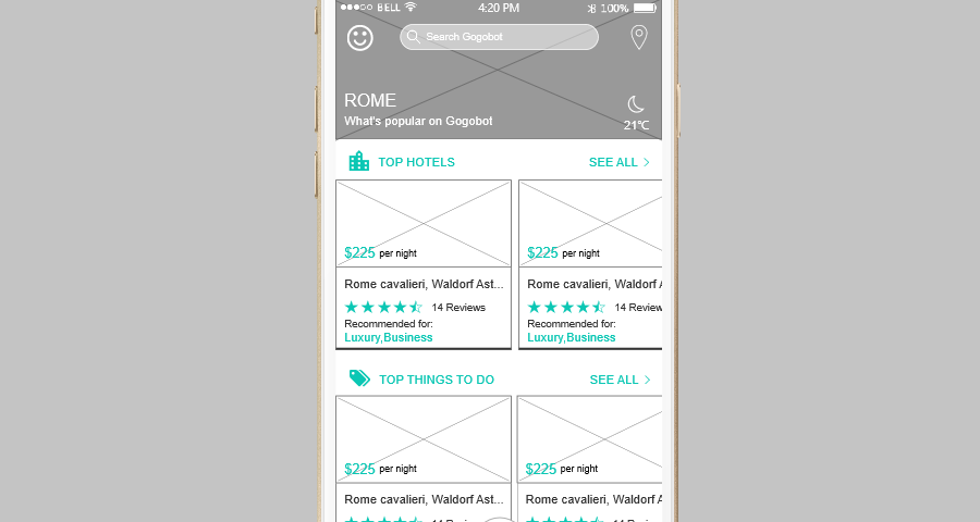
In this mobile first design example, we know some of the elements are required, such as the website’s name and app logo should be concluded. However, not all desktop web design elements are suitable for mobile devices. So let’s set priorities based on the purpose of the travel website:

Start page, login page, welcome page, city list page, homepage, detail page, search page, activity page, personal information page and the like.

Final prototype design effect presentation

How to make a mobile first design 2

Gogobot Online HTML Preview: https://www.mockplus.cn/sample/post/656

Cards design and rolling content display in line with mobile users access and operation of information by scrolling up and down the pages. No big picture seize the limited screen resources, and the scrolling of information is also willing to be accepted by the user. Because compared with the hamburger menu, users are more happy to scroll the pages.

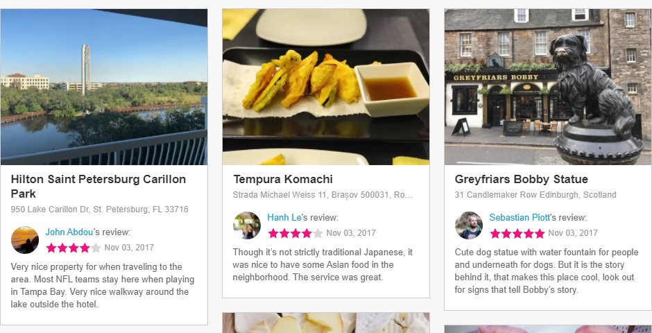
Desktop display: Gogobot

How to make a mobile first design 3

Conclusion

Through the revision of Youtube in this year, I believe that there will be more websites to pay attention to the mobile first design. Sincerely, I hope that the 8 mobile first design examples listed above can be inspirational for the construction of your new product or new website. In a short sentence, due to the limited traffic, the mobile website must be simple and rough, while the desktop website should be the best and be gorgeous. But not the mobile first almost becomes a right bullshit, as it becomes a common sense for almost all of Silicon Valley’s mainstream businesses.

inspiration, material design, sketch

11 Best Free Material Design UI Kits for Sketch & PSD in 2018

Material design has formed it’s distinctive design style since 2014. Created and released by Google, it becomes a full platform design language specification including Android Mobile、Android Tablet、Desktop Chrome, etc. Material Design can be seen across all of Google’s mobile apps including Gmail, Inbox, Calendar, YouTube and even the desktop sites.

Material design provides user a real experience with its clean and direct effect. Many UX/UI designers have followed this trend in their design work. I’d like to share 11 excellent material design UI kits, most of them are free, hope can bring you some inspiration.

1. Free Material Design UI Kit

Format: PSD

Price: Free

What’s special:

  • Works in Photoshop CS6+
  • Free font family used
  • Grouped Layers
  • Customizable vector shapes
  • Material design UI style

Free Material Design UI Kit

This free UI kit has been designed so that you can easily get your next Material Design project kick started quickly. Every element, widget, button and form within the kit can be fully customized as per your requirements. It comes in PSD format and you’re completely free to use the kit in both your personal and commercial design projects.

2. Material Design Kit

Format: PSD, Sketch

Price: 99$/1 user

What’s special:

  • Compatible with Sketch 40+ and Photoshop CC 15+
  • Compatible with iOS & Android
  • 250+ App UI templates
  • Material Design guide

Material Design Kit

Material Design UI Kit is the ultimate library of UI elements, App templates, and style guides combined into high-quality source files for Sketch & Photoshop. Everything you need for a faster workflow and better results when design for Android n is here.

3. Android Material Design UI Kit Sketch Resource

Format: Sketch

Price: Free

What’s special:

  • Compatible with Android
  • Mobile App UI elements

Android Material Design UI Kit Sketch Resource

This Android Material Design UI Kit for Sketch was designed by Ivan Bjelajac. this great Sketch library contains plenty mobile app UI elements with more than 30000 download times.

4. Google Material Design UI Sketch Resource

Format: Sketch

Price: Free

What’s special:

  • Designed by Google
  • Google Material Design layouts

Google Material Design UI Sketch Resource

Google Material Design layouts, contain light and dark symbols for status bars, app bars, bottom toolbars, cards, dropdown menus, search field, dividers, side navs, dialogs, floating action buttons, and other components.

5. Material Kit

Format: SD element and HTML/CSS/JS implementation

Price: Free

What’s special:

  • Lifetime Updates & Regular Support
  • 60 Handcrafted Components
  • 2 Customized Plugins
  • 3 Example Pages

Material Kit

Material Kit is a Free Bootstrap UI Kit with a fresh, new design inspired by Google’s material design. It’s a great pleasure to introduce to you the material concepts in an easy to use and beautiful set of components. Along with the restyling of the Bootstrap elements, you will find three fully-coded example pages, to help you design your next project.

6. Material Kit Pro

Format: PSD element and HTML/CSS/JS implementation.

Price: 79$

What’s special:

  • Material Kit Pro
  • 1000 Handcrafted Components
  • 7 Customized Plugins
  • 11 Example Pages: + Documentation, + SASS Files, + Photoshop Files
  • Bootstrap Based
  • Fully Responsive

Material Kit Pro

Start Your Development With A Badass Bootstrap UI Kit inspired by Material Design. If you like Google’s Material Design, you will love this kit! It features a huge number of components built to fit together and look amazing.

7. Lora Material Design UI Kit

Format: PSD, Sketch

Price: 30$

What’s special:

  • Compatible with Sketch App $ Photoshop
  • Unique screens: 80+ different screens
  • Material design guidelines
  • Organized and named groups and layers
  • Free Google fonts and photos
  • Free try before buying
  • Colourful & Modern Design

Lora Material Design UI Kit

Prototype, design or develop any material design mobile app! Lora Material Design is a huge UI Kit with more than 80 material design screens in 12 categories. Each screen is fully customizable, exceptionally easy to use and carefully layered and grouped in Sketch app and Adobe Photoshop. It’s all you need for quick prototype, design and develops any Material Design app in Sketch or Photoshop. You can use it for designing social network apps, dashboard & stats apps, media & news apps (blogs, videos, galleries…), e-commerce apps (shop, store), booking apps, music and much more… Enjoy!

8. Material Design UI Kit Freebie

Format: PSD

Price: Free

What’s special:

  • Compatible with Photoshop
  • Material design guidelines
  • 6 files categories

Material Design UI Kit freebie

This material design UI kits has a small set of basic pieces consistent with the guidelines of Material Design. By the way, there are photos from Mad Men show, which everyone should appreciate. 

9. Free Material UI Kit PSD

Format: PSD

Price: Free

What’s special:

  • Modern Google material style
  • Fully Editable PSD Files (fully layered files)
  • Well organized layers
  • Modern Design

 Free Material UI Kit PSD

This UI kit contains many usable elements, including profile, music player, statistics, graph, button, navigation menu, sing in page, any much more. It’s designed based on Google Material Design. To create website and mobile app. you can find some small elements and idea about Material design, this PSD gives you free UI templates and elements. You can use those UI elements on your webpage design, or user interface design of your mobile application.

10. Android UI Design Kit 4.4

Format: PSD

Price: Free

What’s special:

  • Action Bar – PullToRefresh
  • Action Bar – NotBoring
  • HoloGraphLibrary
  • Scroll Bar
  • Search Action Bar
  • Contextual Action Bar

Android UI Design Kit 4.4

Every building blocks from the previous version are included in this material design UI kits, making it the most complete Design Kit to date. 2 tips: you must first install both Roboto and Roboto Slab fonts before using the Design Kit. And the recommended way to start designing is to use the Quick Start file, then Shift+Drag the required UI elements from the Building Block file

11. Vivid – Soft Material UI Kit

Format: PSD, Sketch, JPG

Price: $48

What’s special:

  • Built on a Bootstrap grid – 12 columns – 1170px bootstrap grid system
  • 170+ components in 6 categories: Navigation – 43 components; Headers & Sliders – 8 components.

Vivid - Soft Material UI Kit

Vivid is a Soft Material UI Kit, that combines clean typography with pixel perfect elements providing you with a perfect tool for creating any type of website or web application. 6 categories includes Widgets – 55 components, Forms – 26 components, Shopping – 20 components, Blogging – 20 components, Style Guide – includes color palette, typography guidelines, icons and UI elements, Everything is vector based. Everything is well named and grouped helping you to fastly find the desired element and create projects within minutes.

What’s in common among the above 11 material design UI Kits?

1. Design concept

Abandoned excess impurities and disorder, material design only need to retain its most primitive pure form, spatial relationship, change and transition, with the flexible nature of the virtual world, restore the most real experience, to achieve the effect of simple and intuitive.

2. Color scheme

No messy colors, generally choose a main color with a backing color. Use color variations to create more multi-colors. “ Darker color variations are made by lowering brightness and increasing saturation. Brighter color variations are made by increasing brightness and lowering saturation.” check the resources here: How To Use Color In UI Design Wisely to Create A Perfect UI Interface?

3. Icon

In general, the desktop icon size is 48dp X 48dp, while the small icon size is 24dp X 24dp. The best area should be the central 20dp X 20dp.

4. Fonts

Roboto for fonts, Noto for Chinese.

Above are the 11 best material design UI kits created by top designers and developers. If you’re looking for a rapid prototyping tool to quick make use of those material design UI kits, try out Mockplus. With a wealth of 200 components and 3000 UI icons, Mockplus can make your design refined a lot in a faster and easier way. Since the 3.2 release, it allows users to import the ready-made page templates of their choices into the design, helping beginners to get started and inspired in a smooth way. The best thing is Mockplus supports Sketch import, you can easy create a prototyping by adding interactions to those UI elements. Click here to learn more details.

Mockplus

More free resources of material design UI kits:

1. Material UI Kit

Compatible with Sketch App & Photoshop.

2. Music App UI Kit – Material

Compatible with Photoshop.

3. Material Design UI Kit PSD Free Download

Compatible with Photoshop.

4. Material UI Kit

Forma: Sketch, PSD, xd Photoshop, Sketch and Adobe XD.

As a debut shot, it’s my pleasure to share with you this freebie – a Material Design UI kit for Photoshop, Sketch and Adobe XD.

5. Material Design Widgets UI Kit – PSD

Format: PSD. Material design widgets pack for desktop/mobile.

6. Material Design

Format: Sketch. Web, Android, and iOS projects.

inspiration, material design

12 Best Material Design Website Examples to Draw Inspirations

Being firstly released by Google in 2014, Material Design has now already surpassed the realm of mobile apps and become a principle often utilized in web design. There is no wonder that touches of Material Design have been an irreversible trending of the year. But, what’s it exactly? As Matías Duarte, the vice president of Google, explained:

Unlike real paper,our digital material can expand and reform intelligently. Material has physical surfaces and edges. Seams and shadows provide meaning about what you can touch.”

Basically, it’s a way to make design elements look like touchable, and the properties of Goolge itself are the best examples of material design. As of right now, a growing number of websites have been dedicated to this topic, and we’ve made a collection of the best Material Design website examples for you to get inspirations.

12 Awesome Website Examples of Material Design

1. RumChata

RumChaTa Material Design

Combined with the physical aesthetics of Material Design, RumChata delivers a wonderful user experience by making the interface resemble those things in real world. Though it looks colorful, but seems to be intuitive at the very first glance.

2. DropBox Business

Dropbox Material Design

Dropbox Business can be a typical example that adopts the Material Design concept since early times, and the branded blue is very perfectfor material. The website uses one single color palette with black and white included as background.

3. Waaark.com

Waaark Material Design

In response to the guidelines of animation effects, Waaark has showed us a good balance with elements and layout. The animation on the homepage can be switched intelligently with the mouse drag, which looks like wave flows on the screen. But this also obeys the movement rules in reality and all changes are accelerated/decelerated gradually.

4. Serioverify.com

Following by the perpendicular guidelines of Google design, this site has applied the default altitude which gives a sense of consistency for upcoming visitors. Also, developers can control the element’s altitude and projection by one single value.

5. Pumperl Gsund

Pumperl Gsund Material Design

In contrast to Dropbox Business, Pumperl Gsund has used light colors mainly, with some less-noticeable colors in the background, and the remaining is set to black and white. This is not to the guidelines, but doesn’t affect the overall appearance and ease of use of this website.

6. Behance

Behance Material Design

As a great example for getting design inspiration, Behance has a rich set of examples for you to refer to. It makes use of material design well on its own in many places, like spaces, buttons, and text layouts to make people feel pleasant.

7. Codepen

Codepen Material Design

As its name implies, this is a website loved by front-end developers and engineers. It’s a playground for the front-end side of the web and a great place to see really cool examples of material design. Plus, it’s possible to see the underlying CSS, HTML, as well as JavaScript which are used to build that animation or design.

8. Mockplus

Mockplus Material Design

As an all-inclusive prototyping tool, Mockplus also contributes to providing a countless board of good-looking and useful free design materials, from material design, flat design, to interactive design and card design. All those materials are available for free download and use. The ready-made components and icons library will get your design started and well completed in a faster and easier way. All platforms are supported, including Windows, macOS, Android, and iOS.

9. Dribbble

Dribbble Material Design

This is a social network for designers, developers and artists as well as other creative individuals. It’s easy to find bountiful material design resources for both web and app design. Also, you can get inspirations from something as simple as an icon to a full-functional website design.

10. MaterialUp

MaterialUp Material Design

It’s a site focuses solely on the material design topic, providing web examples, mobile app screenshots, tips, tools and many other things. The layout and look of MaterialUp just are reminiscent of Google Drive,and it’s worth your trust to find something of use.

11. Reddit

Reddit Material Design

This may not be the best place to look for design inspirations, and there is a sole sub for Material Design. Half of the posts are design revamps, and the other half are the original design submissions that need feedback. If you want to review and discuss design related topics with like-minded individuals, this is a go-to option.

12. Tumblr

Tumblr Material Design

Whether you design Android/iOS Apps, websites or something else, if you want to learn more about how to better execute material design, Tumblr is a good resource to check out. Scroll down its feed and you will discover examples of different types to get inspirations for the next project.

In Conclusion

Above are the highly-recommended Material Design website examples. It’s noticeable that since the first inception of Material Design in 2014, the end users were always at the forefront of their missions. If you’re ready to get started, you can take some time reading Google’s guidelines and specifications, which will give you a solid base to work from. Also, an excellent tool can help to turn your ideas into reality, and Mockplus is recommended here for its simple-yet-powerful features with a large library of design materials for your free use.

inspiration, menu design, mobile, UI/UX desingn

Top 8 Mobile Navigation Menu Design for Your Inspiration

The mobile navigation menu design is the most important bridge and platform for human-computer interaction that aims at guiding users in a right direction and not getting lost. There is a various type of menu bars available for choice now, but what kind of menu bar could be judged as an excellent design?

A good menu design can not only enhance the user experience of the entire product but also allow users to refreshing. So, I will share my understanding and experiences of the navigation menu in this article.

1. What’s the function of the navigation menu?

  • To enhance the product content and function structure and hierarchy

Navigation is the skeleton of the APP, supporting the overall content and information, so that content in accordance with the information architecture organically combined, visually and clearly displayed in front of users so that fragmented content becomes full and orderly. Meanwhile, the structured arrangement at the same time also enhances the sense of ecology.

  • Highlight the core functions

What the product lying to win the market are its core functions. Therefore, the core function must be put in a place where the users can catch it easily. And the proportion of the secondary function should be controlled to avoid distracting. Through the navigation, it can be a good highlight of the core, and appropriately hiding the secondary functions.

  • Simplify the user journey

Reasonable navigation system and a smooth path to the task allow users to quickly achieve their goals and form a smooth user experience. The simplification of user journey has a direct effect on the user’s viscosity and conversion rate of the product. So the high efficient navigation could guide users simply and directly to the app functions.

2. Types of the navigation menu

In order to understand the categories of the navigation menu after learning its basics, let me show you the details with the quick prototyping tool Mockplus.

1). Tabber – Classic navigation menu

Tabber

Tabber is a navigation control which can be automatically generated in IOS and developed conveniently. So this kind of classic bottom navigation bar has been preferred by many app designers. This design matches with the one-handed operation habits of mobile phone users which helped most of the Apps in the market to get users.

Advantages: Clearly show the current location of the entrance; directly display of the most important entrance of the content information.

Disadvantages: If there are too many function entrances, the model seems unwieldy.

2). Rectangular, grid navigation menu

Grid navigation menu

This grid navigation gets the main entrances together on the homepage, allowing users to make a choice. Such an organization doesn’t allow users to see the content at the first time, which gives users much pressure to make a choice. There are now fewer and fewer applications using this navigation, which often presents in a graphical form as a table of contents on secondary page or aggregates as a series of tool entrances.

Advantages: This kind of navigation is simple but not rough, and the clear and obvious navigation could help to improve efficiency.

Disadvantages: You need to pay attention to color schemes. A design which is too fancy will let users feel visual fatigue.

3). Drawer navigation

Drawer navigation

Drawer sliding navigation is a good way to make up the defect of the switching limitations in Tabber navigation. This problem is solved by arranging the switching items vertically, hiding the menu on the current page. By one click, the entry button will be pulled out the menu like a drawer.

Advantages: It saves page display space and allows users to focus on the current page with a good scalability.

Disadvantages: It’s not suitable for frequently switching applications.

4). Rudder navigation

 Rudder navigation

This popular form of label navigation is often called as “rudder navigation,” because it is styled like the rudder used to command the ship with other operating buttons on either side. When the page has most of the same hierarchy of content, but also requires a very important and frequent operation of the entrance, you can use this APP navigation mode.

Advantages: It can highlight most important entrances with the frequent operation.

Disadvantages: The same as the label navigation.

3. The classic navigation menu design

  • Google’s Material Design uses a “floating action button” to define this navigation. Which differentiates through the icon floating above the UI and has the appropriate dynamic effects, creating a new navigation guidelines.

Material design

  • Similarly, Evernote also draws lessons from this model, the user simply taps the lower right corner of the floating button, you can quickly record the current inspiration.

Evernote

  • Tumblr is equipped with the vivid icons and the appropriate labels. When you scroll down to browse content, these icons will naturally disappear.

Tumblr

  • Messenger’s construction strictly follows the label navigation, with some labels fixed to the top and some clearly showing the main features at the bottom. The icons are clear and easy to understand, and they allow custom labeling, which resulting in a refined and neat visual experience.

Messager

Summary

More and more designers are aware of the importance of mobile navigation menu design for improving the user experience. In Android, we saw the navigation iteration from Hamburg to separate tab bar. In iOS, more and more apps are removing small tab bars and replacing them with bigger, clearer icons. In pursuit of a better user experience and simplified APP design, designers are constantly exploring new design directions along the path of optimization on navigation design.